Written by Sally Wolgin
The Early Warning Indicators of Silicon Valley Bank's Collapse
March 2023
By now, everyone in our industry is well aware of what has happened with Silicon Valley Bank (SVB). SVB could not meet the cash demands of fleeing depositors.
The more important question lies in identifying these issues, months or maybe years, ahead of SVB’s collapse. Could we have identified early warning indicators showing how SVB was positioned to experience significant liquidity problems? Did the trend information, organized and shown in context with other banks in SVB’s peer group, indicate that SVB was running into trouble long before the 2023 crisis? Simply put, the answer is yes. Trend data shows that SVB began to weaken as early as 2021. By 2022, SVB was beginning to experience acute liquidity problems.
In 2022, SVB lost approximately 16 B in Deposits. SVB then replaced those deposits with short term borrowings. This had a profound impact on the Bank’s liquidity. By focusing our attention on the Liquid Asset Ratio and the Short-Term Non-Core Funding to Total Asset Ratio, we see that these two metrics deteriorated rapidly at the end of 2022 (Figure 1). The steep slope of both of these curves indicate just how rapidly the deterioration was occurring.
Figure 1 also shows the average values of SVB’s FFIEC Peer group. By the end of 2022, SVB was underperforming their peers in both ratios. More importantly, the charts in Figure 1 indicate that SVB’s liquidity position was deteriorating far more rapidly than the liquidity positions of their National Peer group.
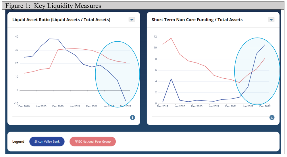
It is interesting to note that SVB’s Liquid Asset Ratio began deteriorating in 2021. Figure 2: Investments, reveals two important trends. First, SVB grew its investment portfolio by approximately $70 B in 2021 (from 42% to 56% of Total Assets). Second, SVB placed these new investments into its Held to Maturity (HTM) portfolio. HTM Investments are not included in the Liquid Asset Ratio calculation because, by definition, the HTM portfolio is intended to be held in the bank’s portfolio until the investment matures and therefore are not liquid assets. In December 2020, 65% of SVB’s investment portfolio were Available for Sale (AFS). By December 2021, that percentage drops to 22%.
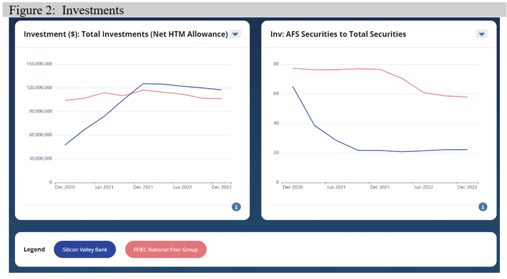
In addition to negatively impacting Liquidity, placing investments in a HTM category allowed SVB to mask how much money it stood to lose, should the HTM Investments need to be unexpectedly sold. By the end of 2022, SVB HTM portfolio was showing significant unrealized losses.
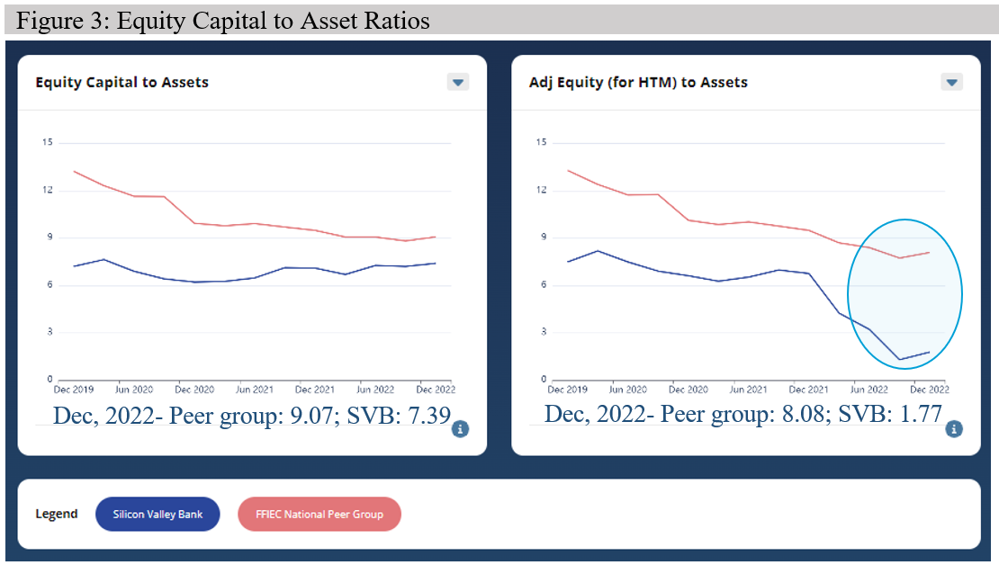
Unrealized losses in the investment portfolio directly impacts Equity if those investments are sold. Figure 3: Equity Capital to Assets, shows how much risk the entire investment portfolio, including HTM’s unrealized losses, affect SVB’s Equity. The chart on the left shows Equity Capital to Assets for SVB and its National Peer group. The chart on the right, Adj Equity (to include HTM losses) to Assets, shows the impact of unrealized HTM losses to the SVB and the National Peer group Equity Capital to Asset ratio. While there are many opinions on the ideal Equity Capital to Asset Ratio, a conservative value is 9.0. At 1.77, SVB is well below the recommended value.
Analyzing Liquidity alone is a one-dimensional view of the bank. Many banks, characterized as Living on the Liquidity Ledge, have weak liquidity measures when compared to their peers. Those banks have made a strategic decision to pursue Profitability by reducing their less profitable liquid assets. Therefore, it is useful to review the SVB as compared to its peers across multiple dimensions to see if the Bank was weakening in other areas. Did SVB’s investment strategy improve its overall profitability?
Table 1: Performance Measures, gives insight on how the Bank compares to its peers over multiple years and across multiple dimensions; Liquidity, Profitability, Capital, Revenue & Expense Management, and Credit Quality.
Table 1 shows SVB’s relative rank in its Peer group from December 2017 to December 2022. The Lakehouse ranks are an indication of Bank’s relative position against other banks in its peer group. A 5 (five) indicates the bank is in top quintile (top 20%) while a 1 (one) indicates that a bank is in the bottom quintile (bottom 20%). These rankings are NOT related to a Bank’s Camel score, nor does the score opine if actual values are good or bad. Instead, these ranks are an indication of how a bank is performing against other banks in its peer group. A bank could be extremely profitable, but still receive a rank of ‘2’ because the other Banks in their peer group are even more profitable.
In 2021, SVB performance, as compared to its peers, begins to deteriorate in both Liquidity and Profitability.
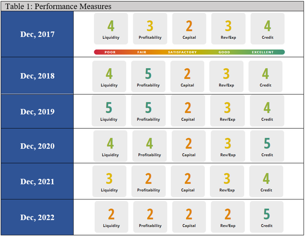
Table 1 should be treated like a weathervane, pointing in the direction that the wind is blowing. In SVB’s instance, they initially were better than their peers in Profitability, Liquidity, and Credit Quality. By 2021, the Bank was performing worse than their peers in Profitability and Liquidity. Not only were they putting too much of their liquid assets into non-liquid assets, but they were also getting a poor rate of return for those investments. The downward trend of these rankings could have been the first indicator of the potential issues at SVB, alerting Investors and Bank Management that SVB was in trouble.
Hindsight is 20/20. Knowing what happened makes it easier to look back at specific measures and identify problems at the bank.
However, these same metrics show that SVB had started a course correction in 2022. Not shown in this analysis is the fact that SVB seems to have begun to sell their investment portfolio in order to originate new loans. Additionally, SVB was doing a great job at managing their credit risk. Who knows what would have happened had they not had that fateful run on their deposits in February?
Now that we can identify where they went wrong, look at the metrics of your own bank. Where are the winds pointing when you compare yourself to other peer banks? If your liquidity is trending downwards, is that trend significantly different than your peers? If it is worse than your peer group, have you asked yourself why? Asking questions like these helps you stay ahead of the competition. Analyze your metrics against relative peer groups to gain context and help your bank make more strategic decisions.
This article was illustrated using LakeHouse Analytics’ Peer Comparison Software.